Paul Rand Book Design
Design and the Play Instinct Layout Exploration
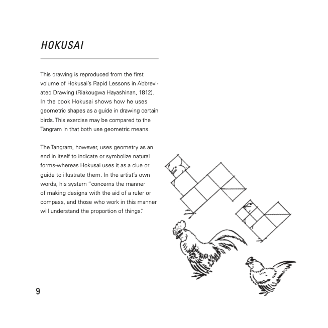
For this UC Davis design project, students were to design an entire book based on Paul Rand’s Design and the Play Instinct essay. We were provided with the text and images and were constrained to working with only three colors and two fonts, but still encouraged to add graphic elements to create unity and dimension.
For my three colors, I chose pure white, a dark gray, and a cool green. For the two fonts, I chose Univers and Bebas Kai. I went with Univers because it is a clean modern font that is easily readable in large paragraphs for smaller text, and Bebas Kai has a little more personality so it was a great accent typeface for the titles as well as a perfect pair to Univers. Normally when working with two typefaces, I will pair a sans serif font with a serif font, but I thought these two sans serif fonts complimented each other nicely and created an overall sleek and modern look, especially next to the thin line work I chose as my added graphic element. The horizontal and vertical line work really ties everything together and strengthens the pages’ unity and coherence.
This project further strengthened my comfort in the InDesign software as well as my creativity in layout design. This project also made me a stronger creative director as I was in full control over all of the design decisions and this book established a higher confidence in myself to make direct and meaningful choices. I strove to stay thoughtful in designing up to 32 pages of work while still maintaining a coherent look throughout the book. I believe that the end result is a tribute to my eye for clean design while still being creative with my positioning in the negative and positive spaces.


Adobe CC InDesign
